Table of contents
Introduction
This is about 7 pages long. You might prefer the one-page version.
In this article I look at how the proportion of Christians varies across geography and between demographic sectors, mostly using ABS census data from 2021 and earlier. My intended readers are thinkers and leaders in the Christian community (who are OK with an overload of statistics).
I first wrote on this topic in 2012, then rewrote/expanded it in 2019. This update in 2023 uses 2021 census data.
This article is viewable both on this site and on Mappage, my web app for looking at statistics. If you're reading this on a large screen, it's best to read this article in Mappage, where I have set it up with lots of maps and charts. If you read this version, you will see references to the interactive charts you can't see here, although I've included a few simple line graphs.
This article is viewable both on this page and in plain form on the GeoMiss site. The one-letter links here will show maps and charts. There are lots of these links, so you need only click the ones that interest you. Most of what I thought important is in the text here. This is not so much an article with a Google Map embedded; it is my statistics & mapping web app (called Mappage) set up to feature this article. Clicking the links just changes the settings on the right. You're not restricted to looking at what the links provide; you can look around for yourself at any other stats. I've spent many hours looking at stats in Mappage in compiling this article. I apologise that it's rough and not so user-friendly.
Christians in the census?
I am most interested in numbers of active Christians - people following Jesus Christ - and I want to know which parts of Australia, by geography or any demographic division, have more or less of us. Whom we count as Christians is obviously a big question, but I'm considering regular or weekly church attendance as something measurable that gives some indication where active Christians are.
The census is the most useful statistical resource in Australia, measuring dozens of variables over the whole population every five years and allowing researchers to download spreadsheets of population broken down by combinations of variables. It's so convenient that I've built Mappage largely to analyse and display census data.
The census measures religious affiliation ("What is the person's religion?"). Christians by this measure were 44% of the population, which is three times the number of regular attenders. So my quandary is that I am far more interested in numbers of active Christians than the largely-nominal numbers of census Christians, but the census is the best data source I have.
So this article mostly looks at census data, with my sad admission that I'm mostly using a less-relevant source. I think what NCLS has written about church attender demographics is more significant than anything I'm going to add here.
Other data
Before jumping into analysing census data, what other measures might be use to gauge the Christian-ness of the population, and what statistics are available?
Average weekly attendance is something easy to measure in individual congregations by a head count. Some denominations ask their churches for attendance numbers, and sometimes denominations may publish totals. Total weekly attendance in Australia was estimated at about 7% in 2011 and has been slowly dropping all this century. Some relevant links: NCLS NCLS NCLS NCLS Eternity. Since those were written, the Covid era brought changes to church participation, reducing attendance further1and making it a less useful metric, with a lot of online participation.
The National Church Life Survey is a large (so hopefully representative) subset of weekly attenders, so any demographics measured in the NCLS can be compared against the general population.
Regular church attendance, ie monthly or more often, is measured surveys (eg the International Social Survey Program) and tends to be nearly twice the weekly number. For any other attributes measured by the survey, it may be possible to to compare the profile of attenders with the rest of the population. Publications by the Christian Research Association have done a lot of this. Some churches or denominations may also record the number of regular attenders they have.
The ideal for me would be church attendance numbers for geographical areas, but I don't have much of that - the Catholic National Count of Attendance has diocese-level stats (and other useful demographics) from 2016, and I have some older data at individual church level for some denominations in SA.
The totals
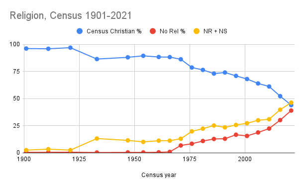
The big news from the census in both 2016 and 2021 was the steep fall in total Christian and rise in No Religion. Christian identification had been decreasing gradually, then dropped from 61.1% to 52.2% to 43.9%. No Religion had been trending up slowly for decades, then jumped from 30.9% to 39.7% to 46.2%. I ncua9lym This graph shows these over the long term. I've shown the No Religion + Not Stated sum too. Not Stated includes those who left the question blank (the question is explicitly optional) as well as those who didn't do the census at all. Up to 2011, much of the Not Stated number could be treated as a soft version of No Religion2I base this on them being higher in the same areas, particularly back in 2006. By 2016 that correlation had dropped off, with a lot of Not Stated transferring to No Religion when it had the box at the top of the question rater than the bottom. Now Not Stated is mostly census-non-respondents, the same as it is for other questions.
In some of my articles I exclude Not Stated from denominators in many of my calculations and thereby get slightly higher percentages; I haven't done that this time..
P m8tpd4vi This chart shows the share has changed since 2011. Hinduism and Sikhism more than doubled their shares with immigration from south Asia while Islam also grew from 2.2% to 3.2%. Many Christian denominations reduced their shares, some by nearly half. Catholic went from 25.5% to 20%.
Christian nfd (not further defined) refers to the 2.7% (up from 2.2%, then 2.6%) who wrote "Christian".3Many Christians - most evangelicals - think of themselves simply as Christian rather than their denomination and this often feeds through to the census response. The question said "What is the person's religion?" - it doesn't ask for denomination, but implies it by listing denominations as options. This 2.7% would include many from independent churches and denominations that didn't have their own box4The Pentecostal box was only added in 2021, by virtue of being in the top 10 responses. Had there been a box before, Pentecostal would probably have made the top 10 in 2006 or 2011., as well as a few nominals.
You can move the year slider to compare the breakdown in 2011, 2016 and 2021. You can click Residence and see the breakdown for a particular state.
McCrindle's 2017 survey on Faith and Belief in Australia also asked about religion identification and returned results of 45% Christianity, 9% other religions, 32% no religion and 14% spiritual but not religious.
The decline in census Christians is dramatic but maybe not too important. The decreasing share of active Christians is attention, but I have no good absolute measurements and I'll leave it to others to discuss that more. My focus comparison across different parts of the Australian population.
Religious groups across geography
I 9suik1xe Looking at how the census Christian proportion varies across different SA4s5Statistical Area level 4 (SA4) is the next size down from a whole state., C ep6r1vul the highest levels are in rural NSW, some places in Queensland and some outer parts of Sydney including Sutherland Shire. The lowest levels are in the inner parts of Sydney and Melbourne.
The columns are coloured by state. You can mouse over the columns to see what areas they represent. You can click "Residence" then click on a state/territory to break it down and see all the SA3s there. You can click "Map" to show the same data on a map.
Non-Christian religions C 0bh1e27x account for 10% (up from 7%, then 8%), spread unevenly, with Parramatta (31%) and three other Sydney areas over 20% while most rural SA4s were below 3%. Note that with most of the charts shown in this article, you can click the play (►) button or drag the year slider.
The No Religion6Showing the whole broad non-religious group. scores I 7aqfl1uv C 8v2g3zbq are high in inner urban areas. Adelaide South comes first with 52%, overtaking Melbourne Inner. Tasmania as a whole averages over 50%, well ahead of other states. Mornington Peninsula is 49.9%7If we drilled down to smaller areas we'd see more "sea/tree change" areas high in No Religion.. Lowest is Sydney South West (14.9%), followed by Blacktown and other multicultural parts of Sydney. No Religion had its biggest increases in places where it was already higher8The standard deviation at SA4 level has increased from 6.8% to 8.8%. The sea/tree change areas increased more than the urban ones.
Note that you can click "Religion" and click any of the other religions/denominations in the list to see their distribution.
M k7scy8ax This map shows which broad religion category (usually Christian or non-religious) has the most in each region. M 5hp0rfqb This one breaks Christianity into smaller categories, so No Religion is usually the largest. M tacjo6sq Then this one shows which Christian category has the most. Zoom in to see more detail on these.
O v0du1zmh This scatter plot shows both the Christian and other religions percentage of each SA4, meaning the most non-religious are in the bottom-left corner.
Attendance ratios
Census data can tell us which regions, age groups or other demographic sectors have more census Christians. But what about active Christians - how do we find them? Since census Christian numbers are broken into denominations and there are also some nation-wide estimates of attendance in each denomination. We can put these together to get an attendance ratio for each denomination. The end of this NCLS page shows some of these percentages. Baptist is 33%, so every three people ticking Baptist in the census, one was at church last Sunday, one wasn't but often goes and one doesn't go.
C ya98qi14 This chart shows the ratios for each category of census Christians. These are weekly; monthly will be about twice as much. Notably, Anglican is only 5%, so a census Anglican is less likely than the average Australian to be a regular attender. In the 2016 example, Pentecostal was 102%, but a lot of those will be in Christian nfd, so I've reduced them and the other higher percentages for when I use them below.
Three blocs of Christians
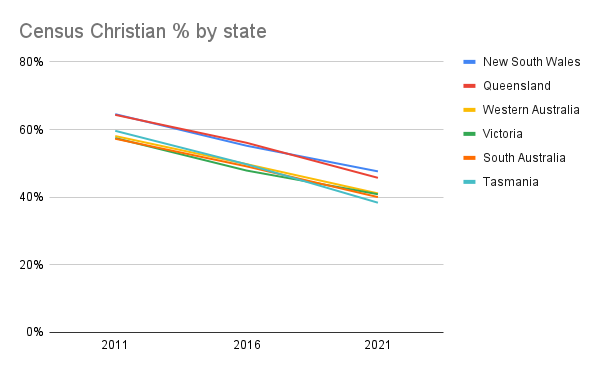
We can break the Christian denominations into three blocs (see the three colours in the image; and I'm omitting the "marginal Christian" groups). C uh62rnl5 Firstly, the Catholic and Orthodox numbers are highest in Sydney South West and Melbourne North West, which both have many people with southern European or Middle Eastern heritage. They are lowest in Tasmania. They fell from 28.3% to 22.4% in 10 years.
The protestant denominations I divide into two blocs, Old and New. Old Prot (NCLS calls them Mainstream Protestant) refers to Anglican (13.4%), Uniting (3.7%), Presbyterian & Reformed (2.3%) and Lutheran (0.7%). Similar to Catholic & Orthodox, the attendance ratio is below 20%.
C kn06hwsa From 2011 to 2021 their numbers almost halved, dropping from 26.2% to 14.7 after decreasing more slowly in the decades before. This decline in affiliation probably lags the decline in regular attendance in the churches by some decades. All of them had a box to tick in the census except Lutheran9which dropped out of the top 10 in 2016.
Old Prot numbers are highest in rural NSW and much of Queensland and lowest in most of Melbourne and some parts of Sydney. Old Prot and No Religion are often found in higher numbers together (Anglo areas); the same goes for Catholic/Orthodox and non-Christian religions (non-Anglo areas) O 75y8ulzk.
For many in the Catholic/Orthodox and Old Prot blocs, their religious identification is part of their cultural heritage. Most of these were national churches: Anglican in England, Catholic in Ireland/Italy/Croatia/Poland, Orthodox in Greece/Russia/Serbia, Presbyterian in Scotland, Lutheran in Germany. One was part of the church by default. Some of the sharp fall is the older generation dying. Most of those who switched to No Religion were not active Christians - many of their parents were, but many weren't. Even when church attendance was high (whether 1950s Australia or 19th century Europe) there was still a large sector of nominals.
For Old Prot, especially Anglicans with their 5% attendance ratio, it's not a great surprise to see their census numbers falling10Especially in Tasmania, where their ratio was only 3% and they seemed to have a disproportionate share of historic child abuse cases.. Catholic identification is a bit stickier - they are perhaps a generation behind, with their attendance ratio falling, ie their mass attendance was dropping faster in proportion than their census numbers, which in turn may drop more in subsequent decades.
These two blocs represent a wide spectrum of belief, practice and what it means to be Catholic/Anglican/etc, worthy of a better look but outside my knowledge. For some of those not participating in church, Christian faith is still a key part of their life; for some it is not. For many, school is something of a substitute for church. In 2022, 19.7% of Australian school students were in a Catholic school, unchanged since 2018 and down from 20.7% in 2013. Other Christian schools are about another 10%.
New Prot is the rest of the protestants: Christian nfd (2.7%, most of these would be protestant), Baptist (1.4%), Pentecostal (1%) and some smaller categories. This bloc adds up to only 6.2% of the population but accounts for significant slice of active Christians and not many nominals, so where New Prot is high, there are probably a lot of active Christians. Thus the census lets us get a good look at where about a third of Aussie church attenders are, while the others are hidden among the nominals.
C ozji2qhc New Prot is highest in Toowoomba (10.9%), Logan-Beaudesert and other SA4s around the outside of Brisbane and some outback SA4s. Melbourne Outer East towers above the rest of Melbourne. Outer suburban SA4s are high, inner urban ones are the lowest.
Sum-product
I can go a step further than this division into three blocs. For any region (or other demographic sector), I can multiple the number for each denomination by its attendance ratio to get a vague weekly estimate of church attenders, giving some measure of the relative Christian-ness of that region/sector. For now I'll call this Sum-product, and it scores 6.3%.11I've also added a protestant-only version of Sum-product, which adds up to 3.9%.
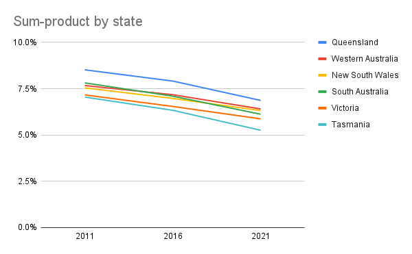
C qrmc0621 At SA4 level, Sum-product correlates strongly with New Prot, with Toowoomba winning by even more. At SA3 in each state level this high correlation is maintained in every state except SA, where the Catholic & Orthodox population is unevenly distributed. The changes in Sum-product since 2011 mostly reflect changes in New Prot. The only increase since 2011 was Sydney South West and the biggest falls were Queensland and non-metropolitan areas. M 7os5igbj Here's Sum-product on a map.
C f1r8kyg9 This chart shows NSW at SA3 level, ordered by distance from central Sydney. Sum-product is lowest in inner Sydney, and highest in the middle-to-outer suburbs, with the rest of NSW below average. Other states also show this pattern. You can change to other states or other religion categories and see how the numbers vary by distance from the CBD of the state capital. (Changing to Map also shows this).
Age, gender
We can also look at religion stats broken down by other demographic categories. Age groups Firstly, we can see C lnhb5eqr the Christian proportion of each age group. The over 75s are around 70% while ages 20-34 are around 30%. Also notable is that 10-14 is much higher than 0-4. If you click the play button, you see the dramatic drop in 10 years in all age groups. This version C 7my60g8v looks the same but animates differently, showing cohorts. We see that about a third of the drop in Christian numbers was due to the older cohorts dying and the new cohorts being much less Christian. However, every cohort decreased and the 25-29 group fell to 31.2% from 61.6% at age 15-19.
C 7sn6h0fo Similarly, the near-halving of Old Prot in a decade is partly due to the death of the older generation. At 2021, the age profile is such that even if every cohort stayed at the same level, we'd see the level continue to drop. In particular, Uniting Church is 7% of age 80-84, but only 1% of age 25-29. You can select any religion/denomination/bloc to see what proportion of the country it has in each age group. C pc7a6ibd The Sum-product is not quite so weighted to older ages, although actual church attendance is, in fact the age profile of church attenders measured by NCLS is even more weighted towards the older age groups than census Christians are.
This community survey by NCLS tells a different story, with attendance of religious services much higher among young adults than other adult age groups.12Possible reasons for this difference: Includes non-Christian religious groups, which have more young adults. Maybe a response bias. Maybe the attender survey undercounts independent churches. which have a younger age profile.
Looking at the age profile of all religions, S lrkda4p9 we see that while the oldest age groups are the most Christian, young adults and young children have the most in other religions and no religion. S izuw4jlf Same again, but breaking Christians into denominations. For both of those charts, you can click Sex then Male or Female.
S 1hyxa6dc 54.7% of females were census Christians compared with 46.4% of males, while the males were more often non-religious. Put the other way, 53.6% of census Christians were female (54.4% of those aged 15+), while only 48.2% of No Religion were female. C huims0fg This chart shows the female proportion of each religion category. Sum-product returns 53.5% female (54.1% for 15+) . NCLS reports that Australian adult church attenders were 60% female13Part of this imbalance is due to the old age profile and women living longer, but women outnumber men in church in every age group. I would also guess that another part of the imbalance is that women are more likely to attend more often, so that the gender ratio of active Christians is a bit more balanced than the 60% suggests..
Language, immigration year
If we break down the population by language14Language spoken at home, which gives priority to any language other than English. (which is my preferred variable for breaking down into ethnic groups), S qmnypjo9 we see nearly all the English-only majority identifying as Christian or no religion, with only 2.7% for all other religions. S 6tnw8hso Looking at the other languages, there are some that are mostly of one religion and some that are mixed. The Sum-product C q7x68sik shows other language speakers at the same levels as English-only. Excluding English-only B ksi4x5nf (there's a lot in this chart, so note that you can put the mouse in the left margin to zoom vertically) high scores include African, Pacific Islander, Aboriginal and Burmese languages as well as Tagalog, Romanian, Armenian and Aramaic15Could be wrong - I really don't know what ratio to use for the Assyrian church and Malayalam. Many European ethnicities are mostly Christian in the census, but they would be largely nominal, while some Asian groups have a large proportion of active Christians. NCLS reported that 27% of church attenders in 2016 were born in a non-English-speaking country, compared to 22% of Australians.
S lmty46jh Here is religion by decade of immigration. Over a third of those who migrated here in 2011-20 were of non-Christian religions. S k24wgcto Here is that decade's migrants broken down by country of birth. You can click Year arrival and choose a different decade.
Education, SEIFA
Education level is an interesting one. I can't compare religion and education directly16The free version of TableBuilder restricts what combinations of variables I can use., but O faq3i87w comparing the proportion of census Christians per SA4 with the proportion with university degrees shows a strong negative correlation, decreasing since 201617 Interestingly, the associated slope has almost halved since 2016, from 0.54 to 0.276. This page (ABS) using 2011 data confirms that degree holders were less likely to be Christian than the less educated. This would be partly mitigated if we broke it down by age groups. This chart O qzomsfe1 shows the proportion of degree holders and Christians in each age group.
O jg23iqr4 The Sum-product measure of Christian-ness across SA4s also correlates negatively with degree holders even though Sum-product is less skewed by age. This relationship has decreased since 2016.
But when it comes to church attenders, we find the opposite. NCLS reported that in 2016, 37% of adult church attenders had a uni degree, compared to 27% of the general population (despite the older, more Christian age groups being less educated - if we broke that down by age group, it would be even more stark)18I wonder if some of this is response bias in the NCLS.. Putting this together, we find that the less educated are more likely to be nominal Christians while the more educated are more likely to be active Christians or No Religion. This confounds any attempt to estimate relative Christian-ness using census data.
O fihbt09y Comparing the Christian percentage with the SEIFA19SEIFA = Socio-economic indices for areas. Four different indices, each a combination of several variables. Pertains to an area rather than indiviuals. Index of Advantage and Disadvantage for each SA3, the correlation was -22% - census Christians clearly tend not to live in rich areas. If we change to the Index of Disadvantage (which isn't that different), this moderates to -11%, reflecting higher Christian numbers in low-wealth rural areas than rough metropolitan ones. The negative relationship got much stronger from 2011 to 2016 but reversed that by 2021. Rich areas discarded Christian identification in 2011-16; poor areas followed in 2016-21 (animation doesn't work for SEIFA stats).
O hnw3zatv The Sum-product measure correlates even more strongly (negatively) with both indices. But again, if we looked at active Christians, we might see a different picture, particularly with so many Anglican church attenders (who hardly show up in Sum-product) living in rich areas. My feeling that Christians were more concentrated in rich areas is what got me onto this topic long ago.
More thoughts on Sum-product
An area with a lot of active Christians in the Old Prot or Catholic/Orthodox blocs will be largely hidden, while a smaller number in the New Prot bloc will show through. Using Sum-product guesses that the active Christians and nominals will mix uniformly. If instead you guess that non-church-attending Anglo-Aussies will be uniformly divided between No Religion and nominal Christians, the outer suburbs will prove to be more Christian and the inner cities more secular. Then again, New Prot accounts for a bigger share of the church attendance pie in outer metro than they are in inner...
The Sum-product across geography could be refined if we had our denomination attendance stats broken down further. I have the attendance for each Catholic diocese and I could use the diocese-level attendance ratio rather than using 11.8% across the board. (The first version of this document did this with Anglican diocese-level ratios).
The ratios for the Catholic dioceses range from 15.7% for Sydney to 6.7% for Hobart, with metro areas higher and Queensland lower. The ratios correlated strongly with the proportion of non-English speakers among the Catholics of each diocese. Adjusting the Sum-product according to this would increase it by up to nearly 1% in parts of Sydney and decrease it by nearly 1% in much of Queensland.
The ratios for Anglican dioceses in 2001 ranged from 6% for Sydney to 3% for Tasmania and Brisbane. Does this suggest that the same would hold for other denominations - could we assume that the Uniting and Presbyterian (or even Baptist and Christian nfd) figures each contain a higher proprtion of nominals in Queensland and Tasmania than in Sydney?
State-level attendance numbers for other denominations would help paint the picture, but we have already seen where the breakdown of active Christian differs from the nominals - by language, age, education level and other factors. I could tweak my ratios in more detail20Philip Hughes pointed this out in an email after I wrote the 2012 version of this., but I would mostly be illustrating what is already known.
As one example, the Sum-product for Port Augusta was 5.8%, after some adjustments it would be below 5%, while actual church attendance was known to be below 2%.
Some bottom lines
We know some sectors of the population have a larger proportion of active Christians than the 10-15% average and some a smaller one.
Seniors > young adults and young children.
Uni-educated > less educated, especially when we compare within age groups.
Women > men.
These imbalances, which NCLS has long been telling us, are well-known. The Church needs to consider why some people are absent and how to reach them.
My look at the geography doesn't show that much:
Queensland and Sydney > Victoria and Tasmania.
Outer suburbs > inner suburbs.
I'm keen to hear anyone's thoughts about anything written here.